Live · July 2026
Pulse
Founder metrics from several services on one screen

- 256
- Tests
- 5
- Integrations
The problem
Founders check the same numbers every morning across a handful of tabs: Stripe for revenue, GitHub for stars, npm for downloads. Pulse pulls them onto one screen. The layout was the easy part. The real work sat upstream of it: the numbers had to be correct, cheap to read, and safe to re-sync without ever double-counting.
How it works
Pulse brokers OAuth through a connection service, so the database never holds a raw provider token, only a connection id and some metadata. Five providers connect through that layer: Stripe, Gumroad, GitHub, npm, and Twitter. Three of them feed the dashboard today, the ones with a normalizer and a schedule behind them. Stripe re-syncs every fifteen minutes for revenue and MRR, GitHub hourly for stars, npm once a day for downloads.
A set of scheduled jobs, sharing one write funnel across cron, backfill, and manual refresh, fans out per connection and writes one pre-aggregated daily snapshot per metric. The write is idempotent: a unique key on user, provider, metric, and date plus an upsert means re-running a day never double counts, even across a midnight timezone boundary.
Money is kept as integer minor units and never summed across currencies. The dashboard splits metrics into flows that add up, like revenue and downloads, and levels that take the latest value, like MRR and stars, then shows a delta against the previous window.
The table is server-driven. The page fetches one page of rows and a windowed total in a single round trip, so there is no client waterfall on load, and the query client only loads when you open a row for detail.
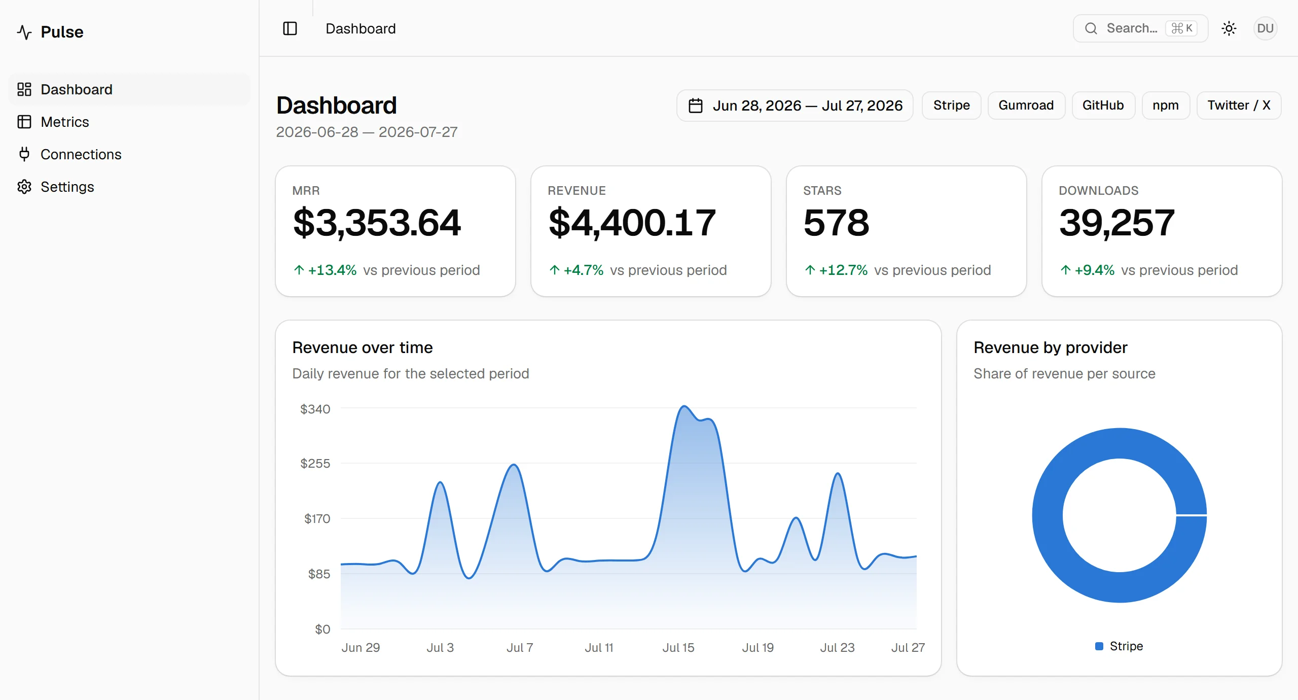
The dashboard on production. Each KPI card shows a delta against the previous window, and the donut has only Stripe in it, because Stripe is the one connected source that carries revenue.
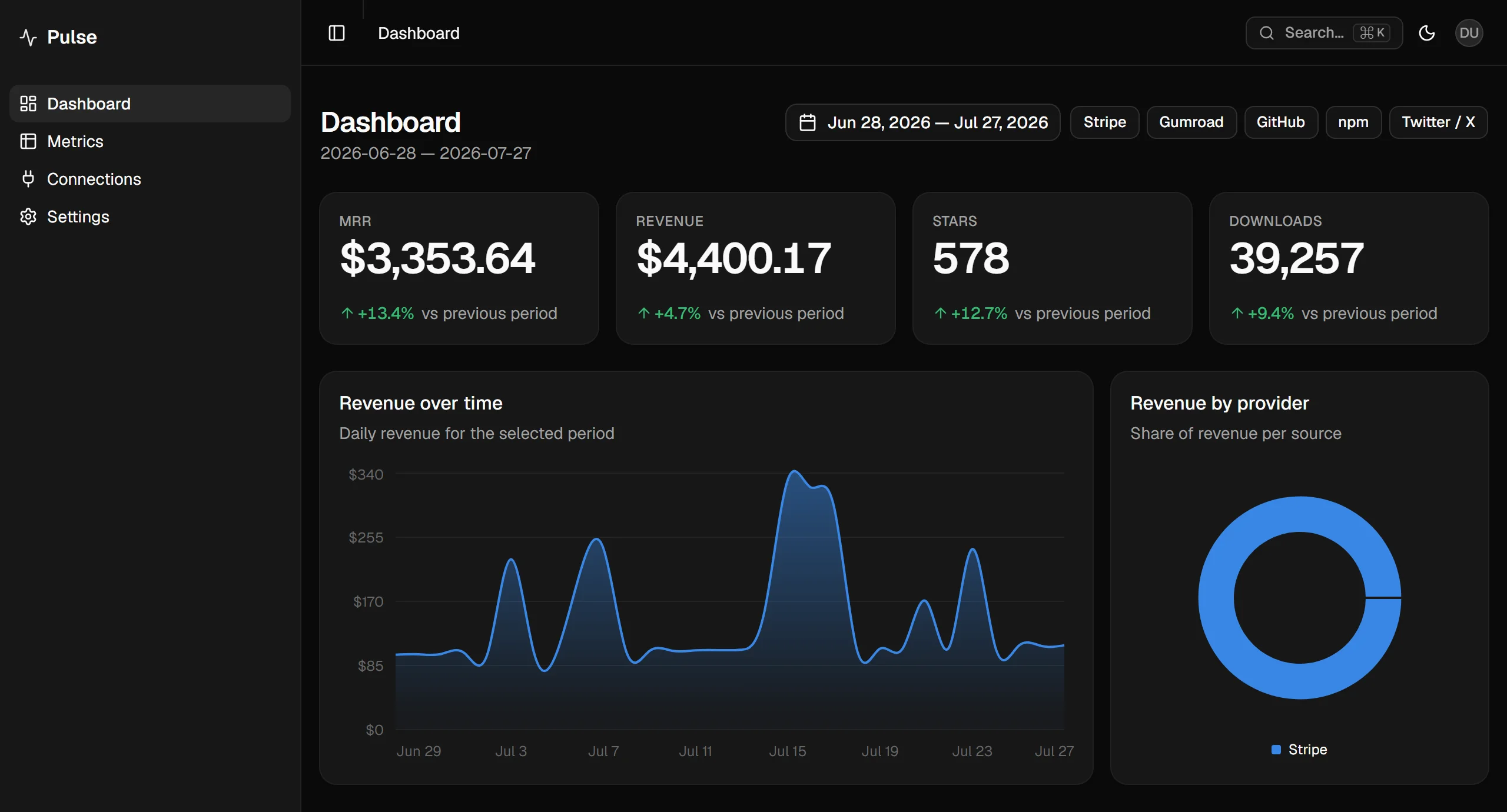
The same screen in dark. The palette is authored in oklch, which an automated audit reports as incomplete instead of failing, so I checked the on-surface pairs by computing the ratios myself.
What shipped
Four KPI cards, a revenue area chart, a provider donut, and a paginated metrics table, sitting in a theme layer where light and dark are each designed rather than inverted, with the accent stored per user and applied without a flash. 256 unit tests cover the aggregation and ingest logic, with eighteen browser scenarios on top. On the production build the dashboard holds a mobile performance score in the low to mid nineties, accessibility at 100, and zero layout shift.
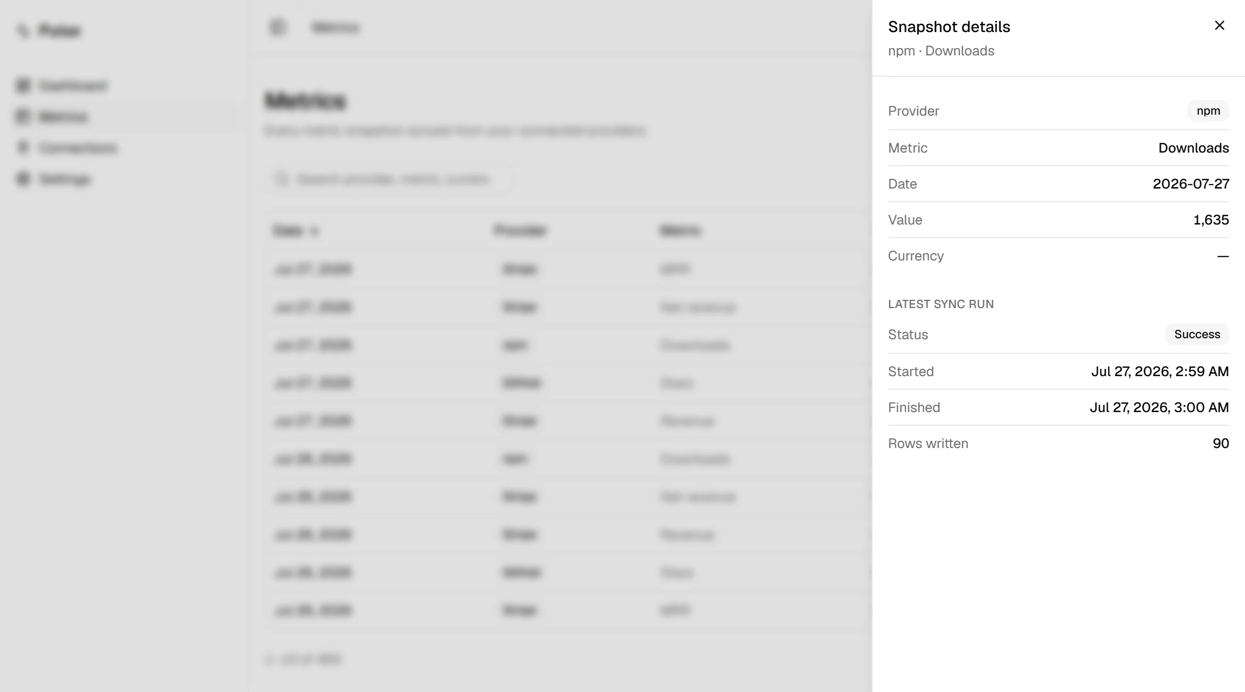
Opening a row shows the snapshot next to the most recent sync run for that provider, down to how many rows the run touched.
The demo
The live link signs you in with one button, so there is no email to wait for. Everyone who opens it shares the same account, which is why the demo is read-only: buttons stay clickable, but a write comes back as a notice instead of going through. The reason is the connect flow. Without a gate in front of it, a guest could attach their real Stripe account to the shared demo user, and whoever opened the page next would be reading someone else’s revenue. The gate sits on the server actions and keys off a separate env flag rather than the account email, so local development and the browser tests still run against that same user. Theme and accent are the exception: they live in a cookie, so each visitor keeps their own.
What I learned
Green unit tests against a mocked service proved nothing about the real contract. Wiring up one live connection exposed an auth assumption the mocks had quietly rewarded, and forced a server-side ownership re-check. The other lesson took longer to see: an idempotent upsert is only safe if the fetch feeding it is complete. An un-paginated fetch followed by an overwrite quietly under-counted revenue, and no fixture full of clean round numbers had caught it.
How it works
From provider to dashboard.
The path every number takes, in three stages, each one built on the one before it.
Connect the providers
Stripe, GitHub, and npm connect through an OAuth broker, so the database only ever holds a connection id, never a raw token.
Daily snapshot
A scheduled job reads the full paginated history and upserts one snapshot per metric per day. A unique key on user, provider, metric, and date means a re-sync never double counts.
One screen
Four KPI cards, a revenue area chart, a provider donut, and a paginated table, in a theme layer where light and dark are both designed.